Philbert 19
- Sandra Wilmann

- Dec 5, 2019
- 3 min read

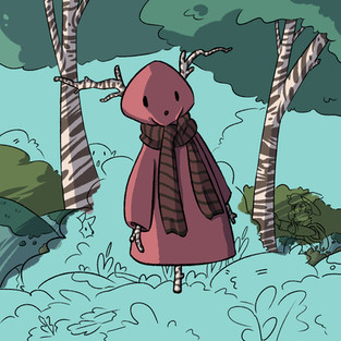
This piece was inspired by a scarecrow I saw at a christmas market in a museum in Norway. This is one of those fancy christmas markets that you pay an entrance fee to even attend, and they had the whole place set up to be from the 1800s, with some houses styled to be other centuries as well. This scarecrow was in the yard of a 1800s stylized house. I loved the antlers made out of sticks, and wanted to create something inspired by that look. At the end of this post, I have a picture of the scarecrow this is inspired by.
I changed a few design elements. In the original, the fabric is a beige tone, and the scarf is blue. The wood is also dark brown, not birch. However I made all these changes because I thought it suited this character better, to be a bit spruced up. Get it?? Should've made it spruce just for that joke. I made both the wood on the scarecrow birch, and the trees in the background birch. I like that they suit together, and imagine this helps the scarecrow blend in with the forest when he needs to.
The best feature of this work is all the small details. The background really pulls the work together, and adding Philbert and Fox there was a great idea. I added them quite late in the background-lineart process, but I added Fox before Philbert. I did want something to be where Philbert ended up, but used quite some time to realise that Philbert was the best thing to give this image the right look. He looks over at Fox and tells him to be quiet, and I imagine he wants to sneak up to the scarecrow.
The background in particular took me a lot of time in this piece. As you see in my process pictures, I did all the shadows and details immediately, instead of afterwards. I do think this helped speed up the process a little bit, but it only helps if youre sure about the look you want as soon as you put the brush down on the canvas. Or else it will just take much longer to redo it. I love how the shadows ended up on the background, and tried to make everything blend together nicely. I wanted Philbert and Fox to be a part of the background, and perhaps you don't see them at the first glance. I think I achieved this pretty well, and it helps guide your eyes through the image, instead of being locked on to the scarecrow only.
In conclusion I am happy with how this piece turned out, and I think my process was very good. I tried to take a few more screenshots this time, and have a few shots of how I coloured in the background and how it looked while colouring that in. I think this helps you see how I worked on this piece. You can actually see I made a small mistake while colouring on image 5. I had been colouring so many rocks, and they all look similar with the little bit of moss. So, somehow, I managed to see Fox's tail as a rock ! Do you see what I mean? In the line art, it kind of looks similar! Luckily I noticed and did a big facepalm and fixed the issue.
Below is the inspiration for this piece. I think the original is a lot more scary than my version. If I was a crow, I would not land on that scarecrow. It is a very interesting scarecrow, and can be the main character of many horror movies.
However I made it a bit more cutesy. It is my curse and my blessing.

I didn't use any references besides that image of the scarecrow for this piece and can't think of any big inspirations that has influenced me to draw this besides what I have already mentioned on previous posts. I think it is very interesting to draw from something I have seen, and which is from my culture, so it is lucky I took a picture of it, even thought that image is of a bit bad quality.
This scarecrow reminds me a little bit of the beast in Over the Garden Wall. Who knows, maybe the creator has also seen those scarecrows! The braches as antlers give it a naturally creepy look.


Comments